The visual identity of AQU Catalunya
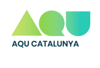
AQU Catalunya's corporate visual identity is based on its institutional logo, consisting of a symbol and the agency's name.
The symbol features the agency's acronym, "AQU”, with each letter taking on the form of a simple geometric shape, namely a triangle, a circle and a square. This choice makes the logo internationally recognisable and conveys the values of a strong institution. Furthermore, the shapes feature AQU Catalunya's corporate blue and green, which shade into other blues and greens to bring out greater contrast and liveliness. With this ombré of colours, AQU Catalunya hopes to showcase its diversity, its commitment to innovation and continuous improvement, and its ability to adapt to changing needs.
Our brand name, "AQU Catalunya", appears in Poppins font.
Together, the brand name and shapes create a harmonious visual appearance that ties in with our fundamental and instrumental values.
Application criteria
- In order to keep the balance of the brand name, we will place the logo on the left side of the page and, whenever possible, at the top.
- The symbol and brand name must always appear together.
- The AQU Catalunya logo, whenever possible, should be applied in positive colour against a white background.
The Communications Unit is responsible for ensuring the correct application of the logo and finding graphic solutions for arising needs.
For queries on how to apply our logo or if you need it in another format, feel free to contact us at comunicacio@aqu.cat or by phone at +34 93 268 89 50.
Downloading the graphic files
Below is the main version of the AQU Catalunya logo in different formats (right-click to save the file):

 Share
Share